Designing the Godot Launcher Logo: Blending Identity with the Godot Engine
Hey everyone, Paulskii here 👋
I'm one of the volunteers on the Godot Launcher project, and I had the chance to design the logo for it. Just wanted to share a bit of the process and how it came together.
What I Wanted the Logo to Be
I had three goals when starting this:
- It had to look good and stand on its own.
- It needed to feel like it belonged next to the Godot Engine.
- It had to be fun, but still feel professional.
When I thought about the word “launcher,” a rocket was the first thing that came to mind. It’s a symbol pretty much everyone understands — something launching, taking off. It made a lot of sense for a game engine launcher, so I used that as the base idea.

Connecting It Back to Godot
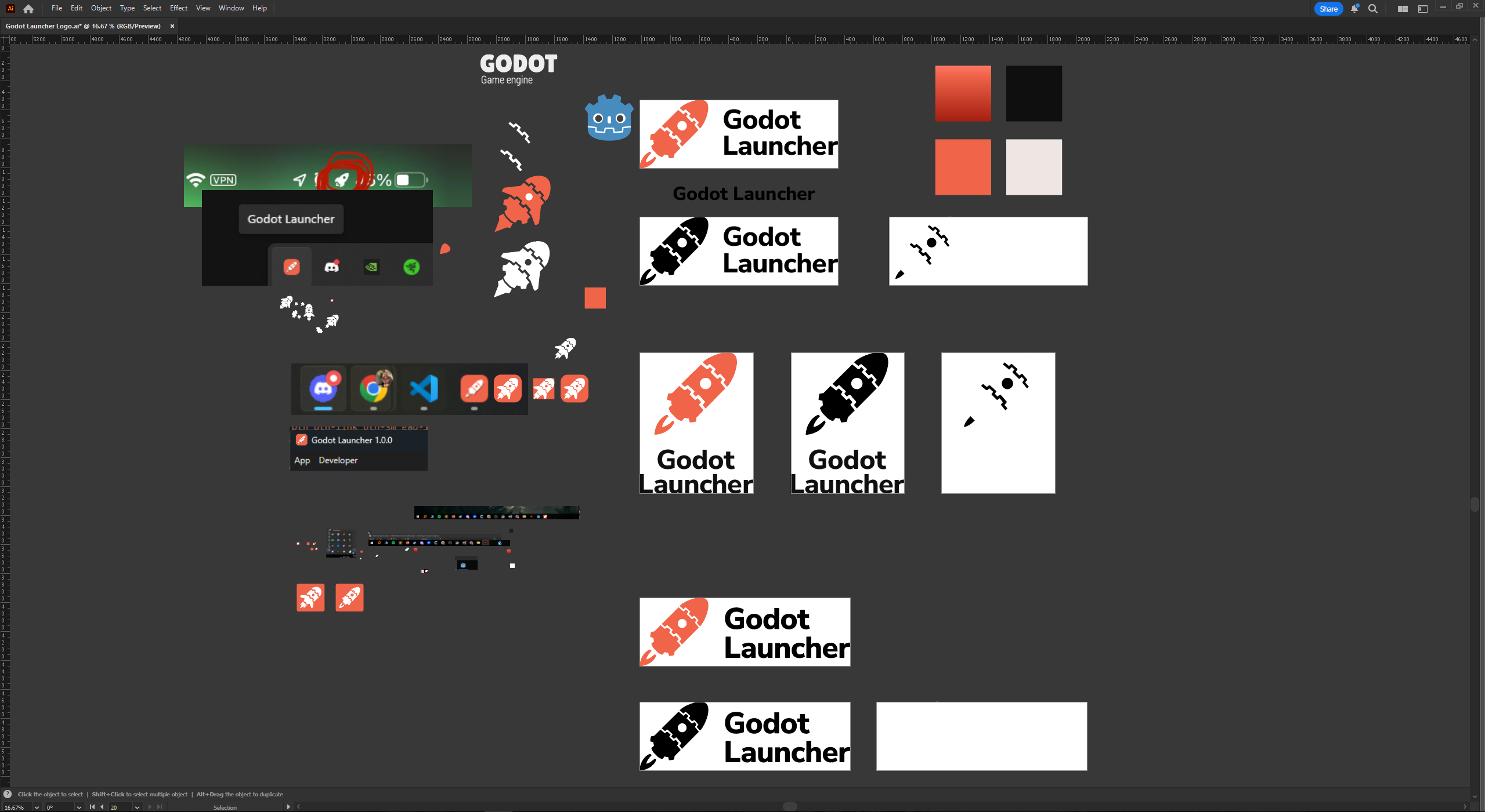
Since this is the Godot Launcher, I really wanted the logo to connect back to the Godot Engine somehow. I looked at the Godot logo (the one by Andrea Calabró) and thought — what if I could build a little rocket using those same kinds of shapes?
I played around with some vector work and started sketching a tiny rocket that could almost feel like a cousin to the Godot logo. Something you could imagine sitting right next to it in your taskbar and not looking out of place.

Building the Final Design
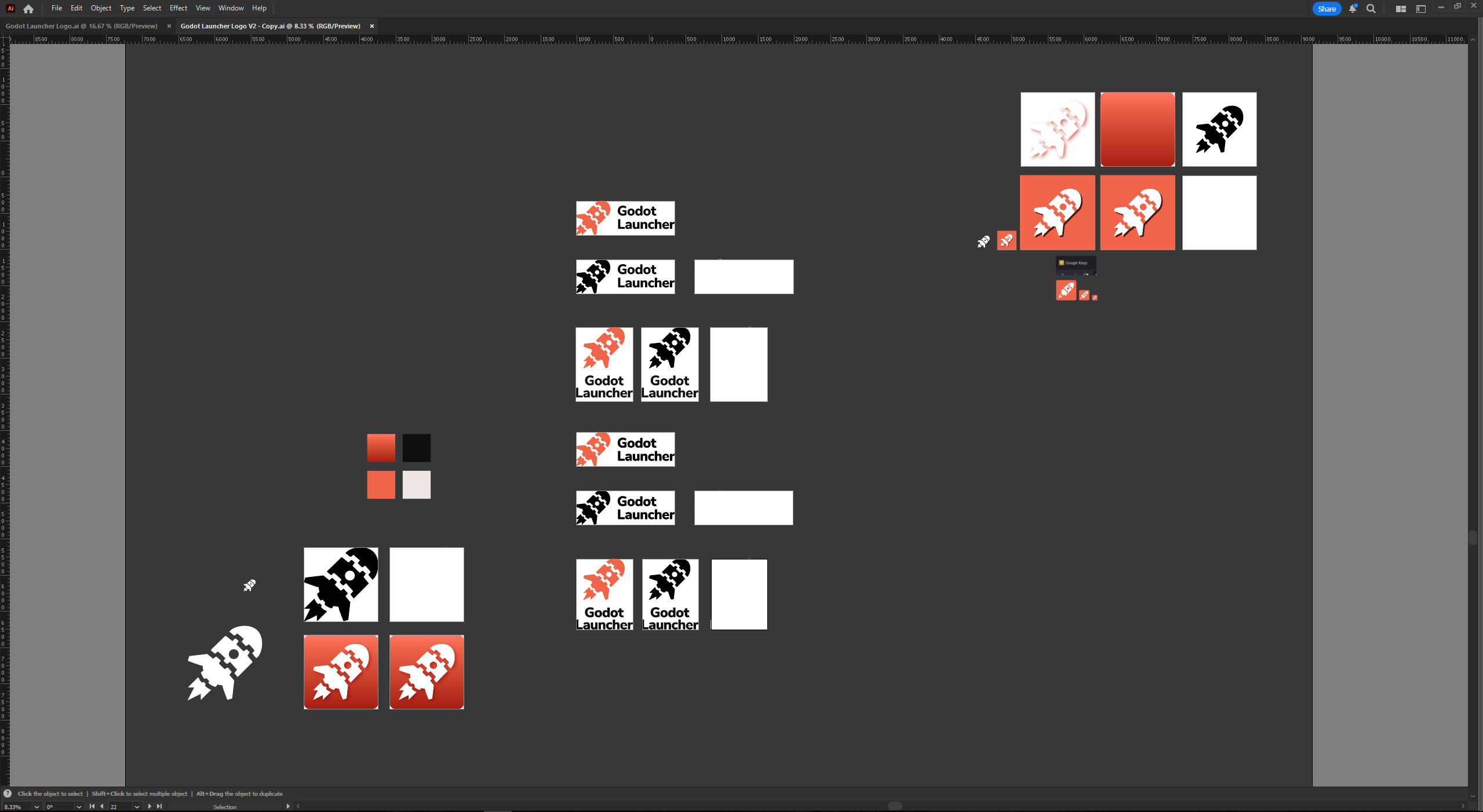
I used Adobe Illustrator for everything — from the rocket to the color palettes and layout ideas.
For colors, I went with a strong orange base to contrast the classic Godot blue. I figured most people will have both icons (Godot and the launcher) side by side, so I wanted them to stand out from each other while still feeling related.
For the font, I picked Nunito Sans Bold. It’s got a friendly and round vibe that’s really close to the one Godot uses, so it felt like a good fit.
The first draft of the logo was a bit thinner, and it didn’t work great when scaled down. So for the second draft, I made the rocket bolder, tweaked some proportions, and added wings and a little exhaust flame to give it some movement and personality.
I worked closely with Mario Debono, who created the Godot Launcher itself. He was super supportive of the direction, and we bounced around a few small tweaks before landing on the final version you see today.
Why This Meant a Lot to Me
Working on the Godot Launcher logo was a really fun challenge — and a personal one too.
I'm super into game UI and UX design. There's something I really love about making interfaces feel smooth, simple, and satisfying to use — especially for tools and systems where clean design really matters. I’ve been working in motion graphics and product design for a while, but my goal has always been to bring those skills into game development.
UI/UX in games isn’t just about menus. It’s about the feel of a tool, the feedback a player gets, the little things that make a dev’s workflow smoother. That kind of invisible polish is what I care about most.
If you’re working on a game or tool and need someone to help with UI/UX design, I’d love to be part of it. Doesn’t matter if it's for players, devs, or somewhere in between — I just enjoy making good stuff easier and nicer to use.
Thanks for reading, and hope you like how the logo turned out!
Until next time — later!
